Sunday 23 October 2011

Final Work for assignment 2

3 pages of A1 interactive pdf


 Three pages of A1 print pdf


To download the pdf's, click this link:
http://www.gamefront.com/files/20918922/pdfs.rar


Third presentation style: walkthrough the model with Crysis Wars Sandbox editor:
a link to download the files needed to open this will be uploaded soon.


Draft text for pdfs:

Reenvisioned, the Lubbering Park sits in the middle of a bustling city. A small square of occupiable space, just waiting to be taken over and used. The playground is situated within a grassy field, with trees spread throughout the back half. There is a slide, tunnel, spiderweb climbing ropes, ball pit and a selection of platforms to climb on.

The design process began with isolating the frame of the building in Google Sketchup. Some of it was taken away, and it was overall simplified. This was then used as a basis for the repurposing.

Around the framework, a basic structure was outlined. Some platforms were put in, and walls were put up to section off areas and create spaces.

Inspiration for the spider web climbing ropes came from a park located in Darling Harbour. It is essentially a large pole with ropes intertwinned, like a spiderweb. Kids can climb up these to sit ontop of the pole, where there is a lookout.


Originally, the building was completely plain from the outside. From this I took a distinct sense of privacy. But once you enter the property, it opens up and becomes much more grand. Especially from the backyard. From this I took the idea that once you occupy a space, it belongs to you and opens up to you.
The Idea of occupying a space was further developed when I heard about the occupy Wall Street movement in NYC. My concepy for reinventing the building then became "a space that anyone can occupy and make their own." A key aspect of this was that the space wouldnt be altered by people being there, so it would be the same for anyone who came there.

The notion of a playground came from the thought that children would be the best people to utilise a space like this. They would be able to come into it, and let their imaginations play and create whatever they like out of the space.


Draft layouts:
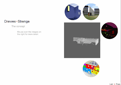
The layout resembles the website of Drewes and Strenge, the original architects. Their website was set out with an information panel on the left, and a series of 3x4 squares on the right, with pictures of their buildings inside. I made the shapes in my layout circular to resemble the cutaways in the walls of my playground. The grey areas are cut away, and will show images and text, while the white is a boarder to them.

The original design I had was brighter, and less organised. I ended up changing it because it looked too messy, and the bright colour distracted from what it was trying to show. It also deviated too far from the original design of the building, taking away some of the link between old and new.


Progress shots:


Sunday 18 September 2011

Week 09 - redesigned proposal

UPDATED IDEA:
Over the course of the week I rethought my initial idea (which I'll leave at the bottom of this post), and completely changed it. I'm goign to repurpose the original building and create a playground area. Taking the idea of privacy from the original, it will be sheltered from the outside, but really open on the inside.

I'm going to take the frame of the building and use that to create a series of poles that will be the basic form of the playground area.


Original idea (not being used anymore)
The original building has a unique sense of division between it's private and public sides. From the outside, it looks like a bland structure, as all you can see is a rendered, white wall. Once you move inside on the other hand, the building opens up with a series of windows, running different lengths and spanning different levels. This floods the structure with natural light, and opens it up to the expansive yard. Overall, from the back side of the building it's a much more inviting and warm place.


Taking this idea, I wanted to expand on the idea of the division between private and public, what can and can't be seen, and by whom you allow the different parts to be seen by.

My initial idea for the reinvention is to create a ring structure, which uses both solid and glass walls to hide or display sections of the house, depending on where you're looking from.


So in the building, there would be two stories, like with the original. The lower facade being made of tinted glass, like the windows out the back of the original house. This allows the occupants to look outside, while maintaining the sense of privacy from the outside world. 


In the centre of the building is a garden, and suspended above it is a platform for the occupants to use to observe the garden area below them. The garden is more of a public space within the comfines of the walls, and the platform above allows the occupants to use the area in their own private way without interacting with the area below them.


week 07

Interactive PDF - 2 Pages:


The interactive PDF can be found here:
http://www.gamefront.com/files/20788519/arch1390+interactive.pdf

Sunday 11 September 2011

Independent study, photo-realistic model.

Original exterior shot:
 Rendered exterior shot:
Photo-manipulated exerior render:


Group Members -
Daniel Rickard - http://danielrickardarch1390-2011.blogspot.com/
Matthew Kruik - http://matthewkruikarch1390-2011.blogspot.com/
Steven Best - http://stevenbestarch1390-2011.blogspot.com/
Alex Lorenzelli - http://alexlorenzelliarch1390-2011.blogspot.com/


1
Title                                     Refugium: Wohn- und Lagergebäude Opus City in Herzebrock
ISSN                                   0173-8046
Journal                                 Architektur, Innenarchitektur, Technischer Ausbau
Number                               1
Pages                                   60 - 65
Year                                     2001

2
Title                                      Über attic: apartment, Herzebrock, Westphalia, Germany
Author                                  Gore, Violet
ISSN                                    0003-861X
Journal                                  Architectural review
Number                                1267
Pages                                    82 - 84
Volume                                 212
Year                                     2002

Sunday 14 August 2011

week four tasks

Reflection on work so far:

My design process began with the creation of the two creatures. The first was based off a flower, while the second was a snow monster. The flower began from the tower idea of the Space Needle, being a long pole section supporting a round top. The inspiration for the snow monster came from the firms other buildings, which are all cubic and linear, which made me think of icicles, from this idea I evolved a creature around that landscape idea. 

Designing the habitats for the creatures started out with me thinking where they would live. For the flower, this was easy. I would live in a flower pot, in a forest. The pot would be a multi story dwelling suspended in a tree. The main feature of it was that the flower creature could climb up to the roof, which is made of soil, and sit there in the sun.

For the snow creature, I designed it's environment around a cave. The cave is inside a large mountain, which in turn is in a large field of snow, with dangerous cliffs nearby. The whole landscape for this one was made around the stark, white patterns found on many of John Graham Jr's buildings. 

At this stage of the design process, I was thinking the flower monster would be the one I took through and designed the landscape for, because it was the more abstract of the two, but after thinking about the final outputs, I found the idea for the snow environment was looking better with both the tools and skills I had. The main factor in this was that I started developing both the environments with the Crysis sandbox, but realised I wouldn't be able to take this work and put it into buildAR. Redoing the work in 3dsMax, the mountain environment is much easier than a forest, and I now think it will also look better as a design than just a bunch of trees. The mountain will stand out more, where as anything in the forest would just blend in. 

In designing the inside environment for the mountain dwelling, the ideas I had from the forest building, taken from the Seattle Space Needle still carried through into this one. Particularly the idea of a layered structure. The interior is made up of shelves of ice protruding from the walls. 


Grid layout for poster design:
Draft work for poster design: